问题描述
我从Fedora 8切换到Ubuntu 9.04,但似乎无法获得好的字体anti-aliasing来工作。看来Ubuntu的fontconfig试图将字符保持为整数像素宽度。当1像素太细而2像素太厚时,这使文本更难以阅读。
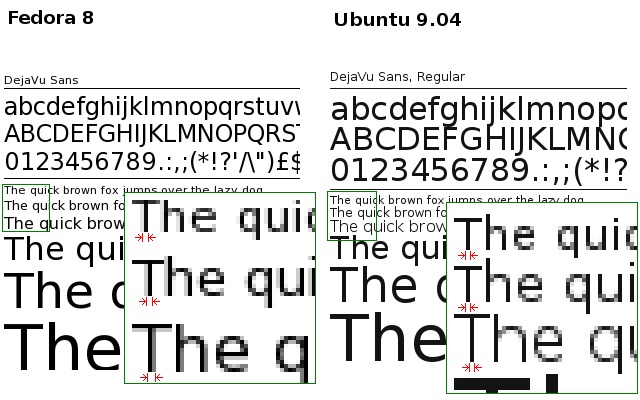
检查下面的图像。在Fedora中,启用fontconfig anti-aliasing后,字体的粗细与字体大小成正比。下面的厚度对于8、9和10pt尺寸是不同的。另一方面,在Ubuntu中,即使启用了anti-aliasing,所有8、9和10pt大小都具有1像素的厚度。这使得阅读大量文本变得困难。
我使用的是相同的主目录,并且我已经检查了两个系统中的X资源是否相同:
~% xrdb -query | grep Xft
Xft.antialias:  1
Xft.dpi:        96
Xft.hinting:    1
Xft.hintstyle:  hintfull
Xft.rgba:       none
GNOME设置:
~% gconftool-2 -a /desktop/gnome/font_rendering
 antialiasing = grayscale
 hinting = full
 dpi = 96
 rgba_order = rgb
因此,问题是:我应该在新框(Ubuntu)中进行哪些更改才能像旧框(Fedora)中那样获得anti-aliasing?
最佳方案
有一个古老的技巧可以使Ubuntu上的字体更流畅(几乎所有运行Gnome的发行版):
在您的主目录(~/.fonts.conf)下打开.fonts.conf并将其粘贴到:
<?xml version="1.0" ?>
<!DOCTYPE fontconfig SYSTEM "fonts.dtd">
   <fontconfig>
      <match target="font">
         <edit name="autohint" mode="assign">
            <bool>true</bool>
         </edit>
      </match>
</fontconfig>
之前:

后:

次佳方案
如John所说,~/.fonts.conf文件对于调整字体配置很有用。
阅读本文后,我终于弄清楚了它是如何工作的:
http://www.kilobitspersecond.com/2009/04/17/ubuntu-font-hinting-you-a-cautionary-tale/